HTML
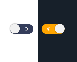
<button class="switch" id="switch">
    <span class="icon-sun-1"></span>
    <span class="icon-moon-2"></span>
</button>
CSS
body.dark{
    background:#17202a;
    transition:.3s ease all;
}

.switch{
    background:#343d5b;
    border-radius:1000px;
    border:none;
    position:relative;
    cursor:pointer;
    display:flex;
    outline:none;
}
.switch:after{
    content:"";
    display:block;
    width:30px;
    height:30px;
    position:absolute;
    background:#f1f1f1;
    top:0;
    left:0;
    right:unset;
    border-radius:50%;
    transition:.3s ease all;
    box-shadow:0px 0px 2px 2px rgba(0,0,0,.2);
}
.switch span{
    width:30px;
    height:30px;
    line-height:30px;
    display:block;
    background:none;
    color:#fff;
}
.switch.active{
        background:orange;
        color:#000;
}
.switch.active:after{
    right:0;
    left:unset;
}
JS
const btnSwitch = document.querySelector('#switch');

btnSwitch.addEventListener('click',() => {

    document.body.classList.toggle('dark');
    btnSwitch.classList.toggle('active');

});

/*
    Fuente: https://youtu.be/2Nmi1sXu12U

    Nota:
    - En el vídeo el proyecto se realiza con el procesador CSS (SASS)
    - Para este ejemplo se ha modificado a 100% CSS3
    - y también con diseño minimalista.

*/


Deja tu comentario